This version brings a better dpi support. I have been extremely naive thinking I was done with the DPI awareness.
Until I bought a new device for myself, set up at 200 dpi, and realized FileVoyager was not far from being unusable…
Even the Shell context menu was not responding.
The experience was terrible and a spent a lot of time re-designing visual components.
Sometimes it was a peace of cake, but I often had to dive into several layers of third party components, this gave me the hardest time.
The things I show below are for information only. All those issues are now behind, but you have to download this version of course.
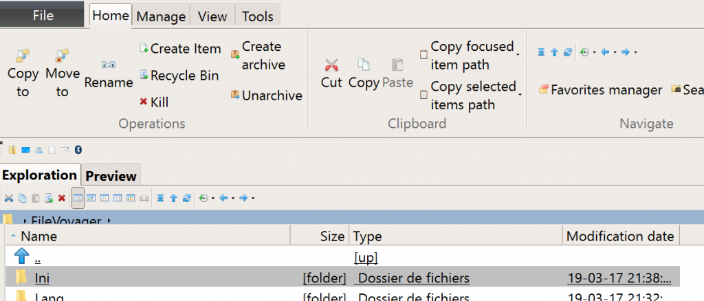
Up until now the main form suffered from the size of the icons. The icons were too small and unrecognizable. The address bar was truncated. Drop down arrows are nearly invisible.

The status bars at the bottom were truncated.

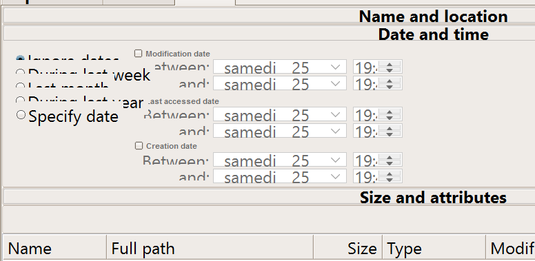
The search was the worst with parameters simply unreadable.

The file compare was impacted

As well as the folder comparison

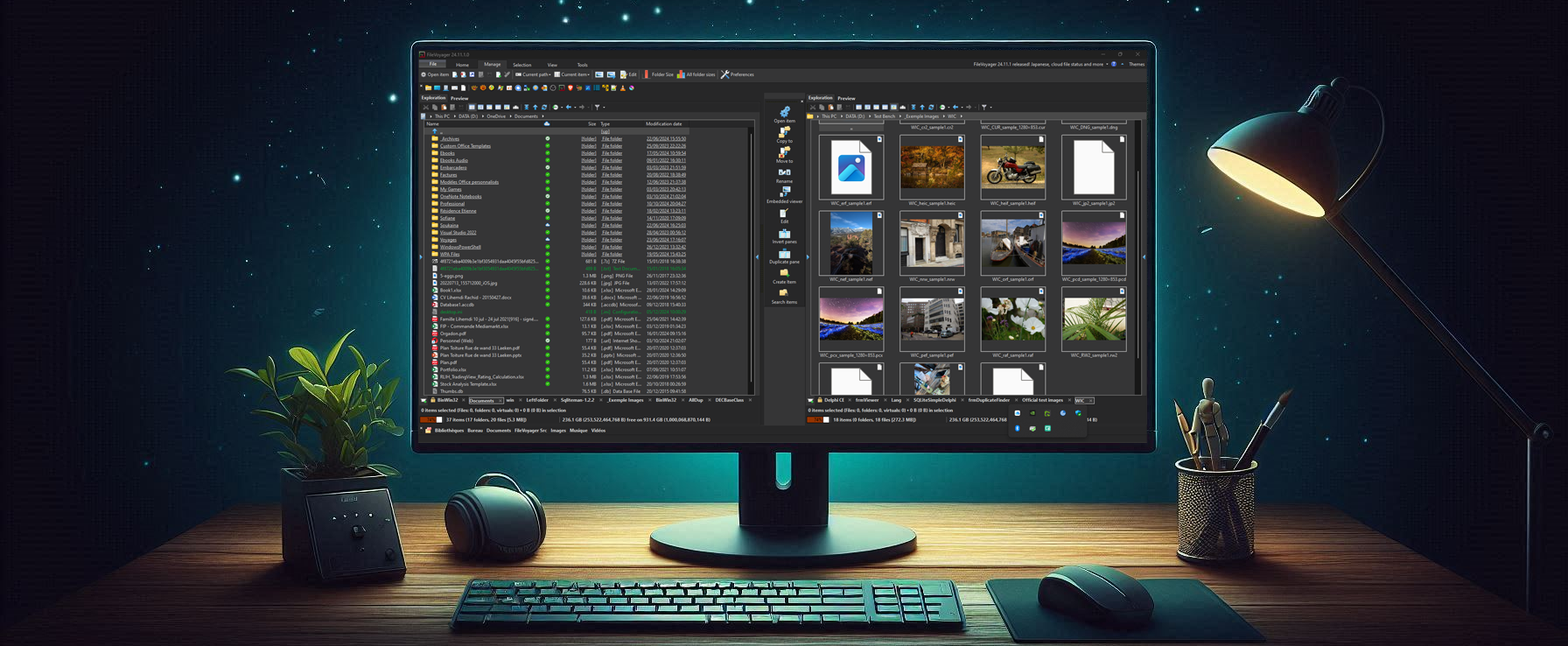
With this release, everything presented above is corrected.
So hurry up, and download the latest version. Or simply let’s FileVoyager update itself.
And don’t forget, if you like FileVoyager and want to contribute to its development:
- You can help by buying me a coffee
 , because I work on it late at night
 - You can help by creating, maintaining or correcting translation files. Head to this article, your help will be welcome.
- You can help by creating, maintaining or correcting tutorials in the forum
- You can help by liking, following or talking about FileVoyager in social networks, or in blog posts, or in articles.
- You can help by reporting bugs or wrong behaviors.
- You can help by requesting features.
- You can help by participating in the forum.
- Or you can still help by buying me a coffee
 , because I still work on it late at night
And if none of the above suits you, just use FileVoyager and if you enjoy it, I am rewarded.

